
Math Gets Around in the Big City
Math has gotten a bit of a visibility boost recently, in the form of posts by professor Steven Strogatz at the New York Times blog. For three weeks, starting at the end of May, Professor Strogatz filled in for usual blogger Olivia Judson, and during that time he used the platform to write some highly readable musings that show the presence of mathematics in unlikely places, and touch on some of the directions math is headed in the 21st century.
Let me highlight the first post, titled "Math and the City." Professor Strogatz begins this article by describing Zipf's law, an observation attributed to linguist George Zipf regarding the distribution of words in a language (for a linguistic motivation, you can check the Wikipedia article on Zipf's law).
 One of these things is not like the other.
In the context of cities, the law states the following: in a given country, if you rank the cities within that country by population, the largest city should be about twice as large as the second largest city, about three times as large as the third largest city, and so on. In other words, a city's population is inversely proportional to its rank.
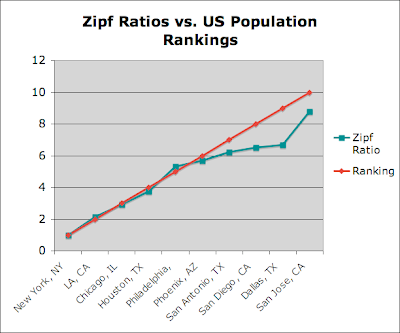
Using the power of the internet, it's not too hard to find current population data to try and verify this observation. Here's a table illustrating Zipf's law for U.S. cities (I pulled the population data from here):
| City | Estimated Population (July 2007) | Zipf Law Ratio | Ranking |
| New York, NY | 8,274,527 | 1 | 1 |
| LA, CA | 3,834,340 | 2.158 | 2 |
| Chicago, IL | 2,836,658 | 2.917 | 3 |
| Houston, TX | 2,208,180 | 3.747 | 4 |
| Phoenix, AZ | 1,552,259 | 5.331 | 5 |
| Philadelphia, PA | 1,449,634 | 5.708 | 6 |
| San Antonio, TX | 1,328,984 | 6.226 | 7 |
| San Diego, CA | 1,266,731 | 6.532 | 8 |
| Dallas, TX | 1,240,499 | 6.670 | 9 |
| San Jose, CA | 939,899 | 8.804 | 10 |
Those with a visual bent can also take a look at a graph of the data:
Professor Strogatz doesn't provide heuristics for why Zipf's law should be true, but he does observe that this phenomenon has been around for more than a century, and can be observed in countries throughout the world (with varying degrees of agreement). He then goes on to discuss more recent mathematical observations regarding urban development, including the observation that cities, as with many other things, enjoy economies of scale. For example:
If one city is 10 times as populous as another one, does it need 10 times as many gas stations? No. Bigger cities have more gas stations than smaller ones (of course), but not nearly in direct proportion to their size... the bigger a city is, the fewer gas stations it has per person...
The same pattern holds for other measures of infrastructure. Whether you measure miles of roadway or length of electrical cables, you find that all of these also decrease, per person, as city size increases.
In other words, the distribution of infrastructure is not quite the same as the distribution of the population - as population grows, so too does infrastructure, but it can grow more slowly. Further discussion can be found in the article.
Of course, there are many questions here. First of all, a little digging will show you that this trend is stronger in some countries rather than others. Why is this? Also, why must we break down our analysis by country to look at these trends? Why don't we see this pattern emerge if we simply rank cities independent of country?
Moreover, this Zipfian trend depends of course on one's definition of the word "city." If one extends the notion to municipal areas, the trends become less clear. So, how should we define what it means to be a city?
As I learned from a recent article on The Daily Dish, Tim Gulden of George Mason University has recently tried to answer some of these questions. By using nighttime satellite data, Professor Gulden and his coauthors were able to more rigorously and consistently measure city sizes globally, and were able to use these measurements to compare rankings for population, economic activity, and patented innovations.

In their paper (the abstract of which can be found here), the authors give evidence supporting a Zipf-type distribution for all three statistics, and use this data to argue against the idea that globalization is making the world "flatter," i.e. more equidistributed with regards to things like population or economic activity. Instead, they argue that the world of the future will feature global ranks that follow more of a Zipf distribution, and that one reason why this hasn't happened already is because it currently can be difficult to migrate between the barriers of different countries.
For more math in the spotlight, I'd encourage you to read Dr. Strogatz's other posts (here and here). Happy reading!
Psst ... did you know I have a brand new website full of interactive stories? You can check it out here!
comments powered by Disqus