Some Readership Statistics
This week marks the third anniversary of Math Goes Pop! As such, I thought it might be appropriate to engage in a bit of navel-gazing. But since I can gaze at my own navel whenever I please, I'd like to flip the script, as it were, and turn my attention towards the collective navels of my readership.

Our cat's third birthday is also this week. It is unclear which event he is celebrating, although the dilated pupils suggest he is celebrating a bit too hard.
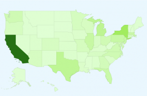
I'd like to share with you some data on the geographic distribution of my US readers. While there is a large California bias, people from all over the country seem to have stumbled upon this corner of the internet, and have hopefully enjoyed their time here.

This represents you, gentle reader. Darker green means more viewers.
Of course, a California bias shouldn't be all that surprising. After all, California is the most populous state in the country, accounting for roughly 12% of the country's total population, according to this 2010 Census data. A more interesting thing to think about, then, is not the map pictured above, but how the map contrasts with actual population data for each state. For example, New York is a hair darker than Texas on this map, even though Texas has a larger share of our population: roughly 8% as compared to 6% for New York.
One way to compare population data with Math Goes Pop visitor data is through rankings. This table compares the rankings, and shows the relative difference for each state:
| State | View Proportion Rank | Population Rank | Rank Difference |
| California | 1 | 1 | 0 |
| New York | 2 | 3 | +1 |
| Michigan | 3 | 8 | +5 |
| Texas | 4 | 2 | -2 |
| Illinois | 5 | 5 | 0 |
| Pennsylvania | 6 | 6 | 0 |
| New Jersey | 7 | 11 | +4 |
| Massachusetts | 8 | 14 | +6 |
| Florida | 9 | 4 | -5 |
| Virginia | 10 | 12 | +2 |
| Washington | 11 | 13 | +2 |
| North Carolina | 12 | 10 | -2 |
| Ohio | 13 | 7 | -6 |
| Maryland | 14 | 19 | +5 |
| Georgia | 15 | 9 | -6 |
| Missouri | 16 | 18 | +2 |
| Connecticut | 17 | 29 | +12 |
| Minnesota | 18 | 21 | +3 |
| Oregon | 19 | 27 | +8 |
| Arizona | 20 | 16 | -4 |
| Colorado | 21 | 22 | +1 |
| Wisconsin | 22 | 20 | -2 |
| Tennessee | 23 | 17 | -6 |
| Indiana | 24 | 15 | -9 |
| Washington DC | 25 | 50 | +25 |
| South Carolina | 26 | 24 | -2 |
| Louisiana | 27 | 25 | -2 |
| Kentucky | 28 | 26 | -2 |
| Iowa | 29 | 30 | +1 |
| Utah | 30 | 34 | +4 |
| Oklahoma | 31 | 28 | -3 |
| Alabama | 32 | 23 | -9 |
| Kansas | 33 | 33 | 0 |
| Nebraska | 34 | 38 | +4 |
| Arkansa | 35 | 32 | -3 |
| Nevada | 36 | 35 | -1 |
| Mississippi | 37 | 31 | -6 |
| New Hampshire | 38 | 42 | +4 |
| Rhode Island | 39 | 43 | +4 |
| New Mexico | 40 | 36 | -4 |
| Idaho | 41 | 39 | -2 |
| Maine | 42 | 41 | -1 |
| West Virginia | 43 | 37 | -6 |
| Hawaii | 44 | 40 | -4 |
| Vermont | 45 | 49 | +4 |
| Alaska | 46 | 47 | +1 |
| Montana | 47 | 44 | -3 |
| Delaware | 48 | 45 | -3 |
| North Dakota | 49 | 48 | -1 |
| South Dakota | 50 | 46 | -1 |
| Wyoming | 51 | 51 | 0 |
The rankings give us some information: we see that Indiana and Alabama are not as well represented in readership as one might expect given their population rankings (both states have Math Goes Pop readership rankings 9 levels below their population rankings). On the other hand, folks from DC, Connecticut, and Oregon are visiting this site more than would be expected based on population numbers alone; readership rankings for these states are 25, 12, and 8 levels above their population rankings, respectively.
But while the rankings tell us some things, they leave a great deal out. For instance, while California is ranked first in both the proportion of the US population and the proportion of visitors to this site, the rankings tell us nothing about how these proportions compare to each other. In fact, while California boasts the number 1 proportion in both categories, the proportion of California viewers to Math Goes Pop is more than twice the proportion of California's population (26% of my viewers vs. 12% of the US population).
Comparison of the proportions in this way allows us to get a better understanding of how visitors to this site are distributed across the country, as compared to the overall population distribution. While the population is distributed more heavily in California, the proportion of California Math Goes Pop visitors is greater than can be explained by simple population data.
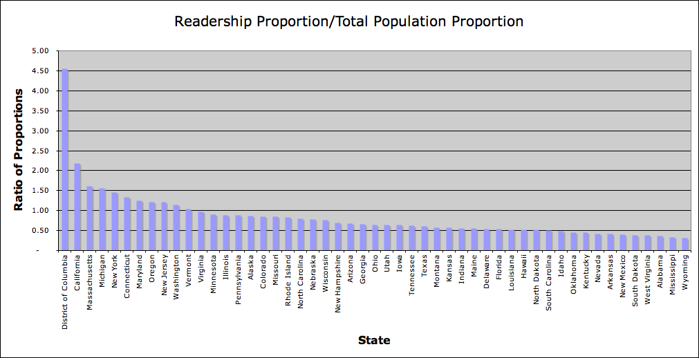
If we compare the state-by-state readership proportions to overall population proportions, we get the following picture:
Big ups to our nation's capital for having the largest share of viewership relative to its overall share of the country's population. In addition to DC, the proportion of readership from 10 states is greater than the state's proportional population: California, Massachusetts, Michigan, New York, Connecticut, Maryland, Oregon, New Jersey, Washington, and Vermont. For example, while Massachusetts accounts for roughly 2% of the country's population, thus far it has accounted for nearly 3.5% of Math Goes Pop readership.
I won't go into an analysis of why some states might be over- or underrepresented in the blog's readership according to this metric. I just thought it might be appropriate to share some of this data in commemoration of Math Goes Pop! I hope you will continue to enjoy the material posted here. And if you live in Wyoming, Mississippi, Alabama, or any of the other 40 states I didn't mention in the paragraph above, let's see what we can do to get some mathematical love flowing in your neighborhood.
Psst ... did you know I have a brand new website full of interactive stories? You can check it out here!
comments powered by Disqus

